Regola il grafico a barre per allargare la barra in Excel
Per allargare la barra in un grafico a barre, eseguire le seguenti operazioni.
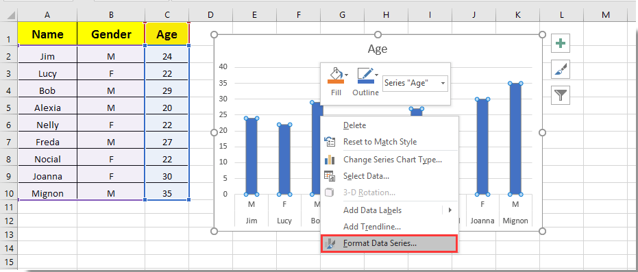
1. Fare clic su una barra qualsiasi nel grafico a barre e fare clic con il pulsante destro del mouse su di essa, quindi selezionare Formato serie di dati dal menu di scelta rapida. Vedi screenshot:
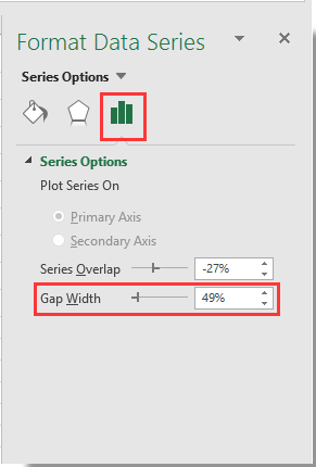
2. Nel spuntare Formato serie di dati riquadro, sposta il file Zoom bar del Larghezza gap sul lato sinistro fino a quando la larghezza della barra soddisfa le tue esigenze sotto Opzioni di serie sezione. Vedi screenshot.
3. Chiudi il Formato serie di dati riquadro.
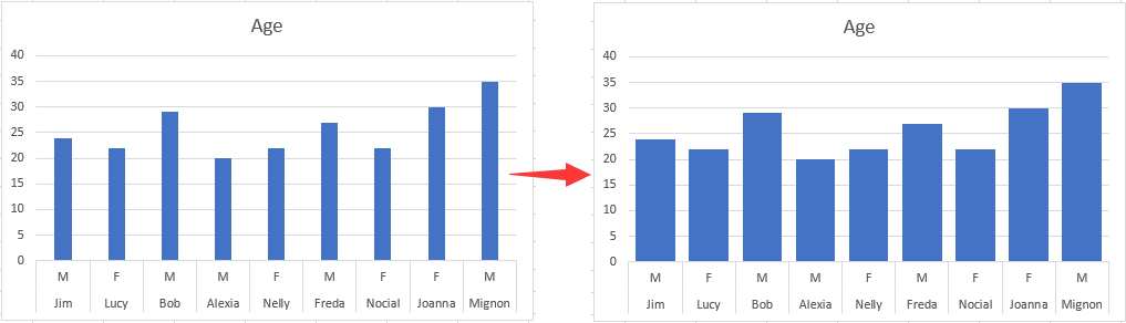
Quindi puoi vedere le barre nel grafico a barre specificato che diventano più larghe come mostrato nell'immagine sottostante.
I migliori strumenti per la produttività in ufficio
Potenzia le tue competenze di Excel con Kutools per Excel e sperimenta l'efficienza come mai prima d'ora. Kutools per Excel offre oltre 300 funzionalità avanzate per aumentare la produttività e risparmiare tempo. Fai clic qui per ottenere la funzionalità di cui hai più bisogno...
This comment was minimized by the moderator on the site
Also been looking for a way to do this. Line chart over dates/times with bars when data (KGs) increased i.e. new delivery. Rather than change x axis type to text, I ended up having a filled border on bar. Need to select the same color fill as line and then select the border width to widen the bar. Can be done in VBA if chart is being produced with VBA?
This comment was minimized by the moderator on the site
Sorry... this doesn't work on a PC with Office365 2020.10. The control is there but even when set to zero percent for the gap width, the bars are scrawny little narrow bars which will accommodate no text overlay. Something not right.
This comment was minimized by the moderator on the site
Not in office365 but it might work for you, I have found a similar issue with "scrawny" bars on dates that adjusting overlay and gap width don't correct. To fix was as simple as reordering my data from oldest to newest and then changing axis type to "text axis" rather than "date axis" and then adjusting overlay and gap width. Give it a crack?
")
")